Apothékary
Apothekary is an herbal wellness brand that bridges Eastern herbalism and Western science. In their dedication to kaizen (continuous improvement), Apothékary sought a rebrand (done by Forner) that showed the efficacy of herbal medicine, addressed packaging concerns, and laid the groundwork for future growth.
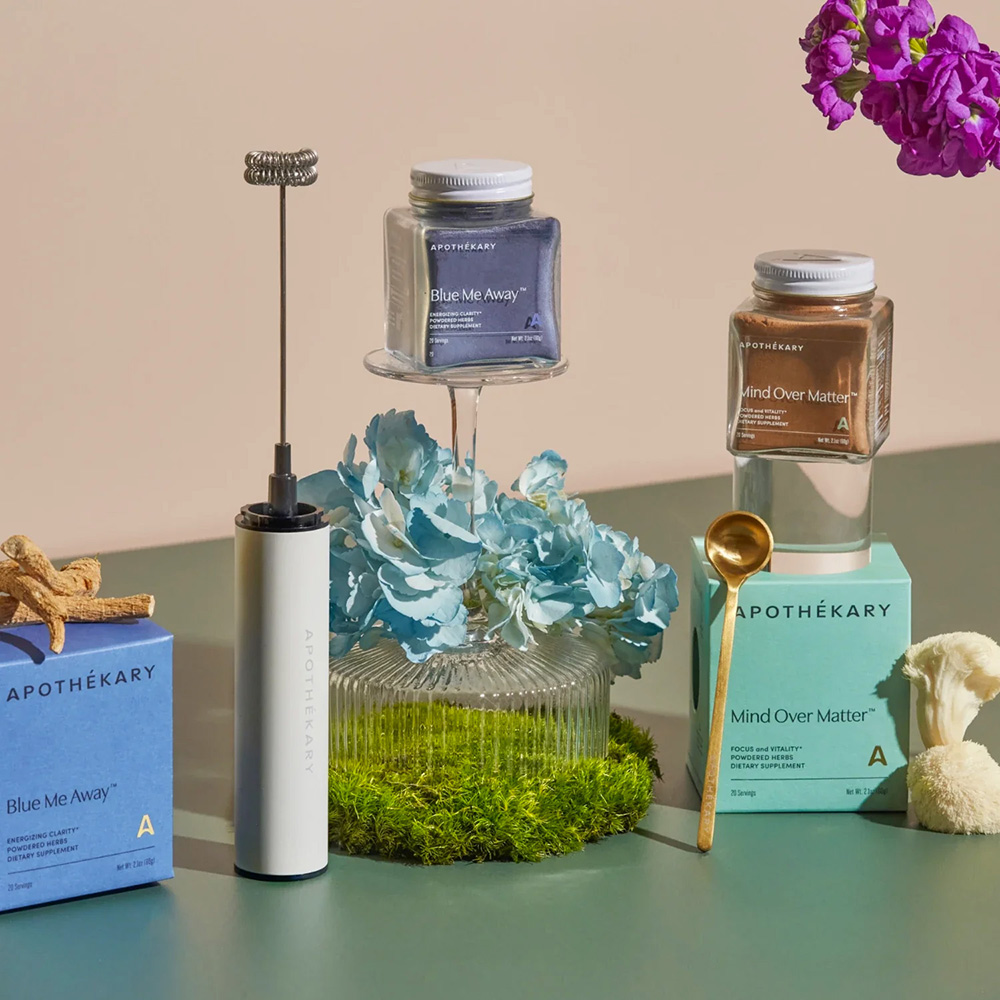
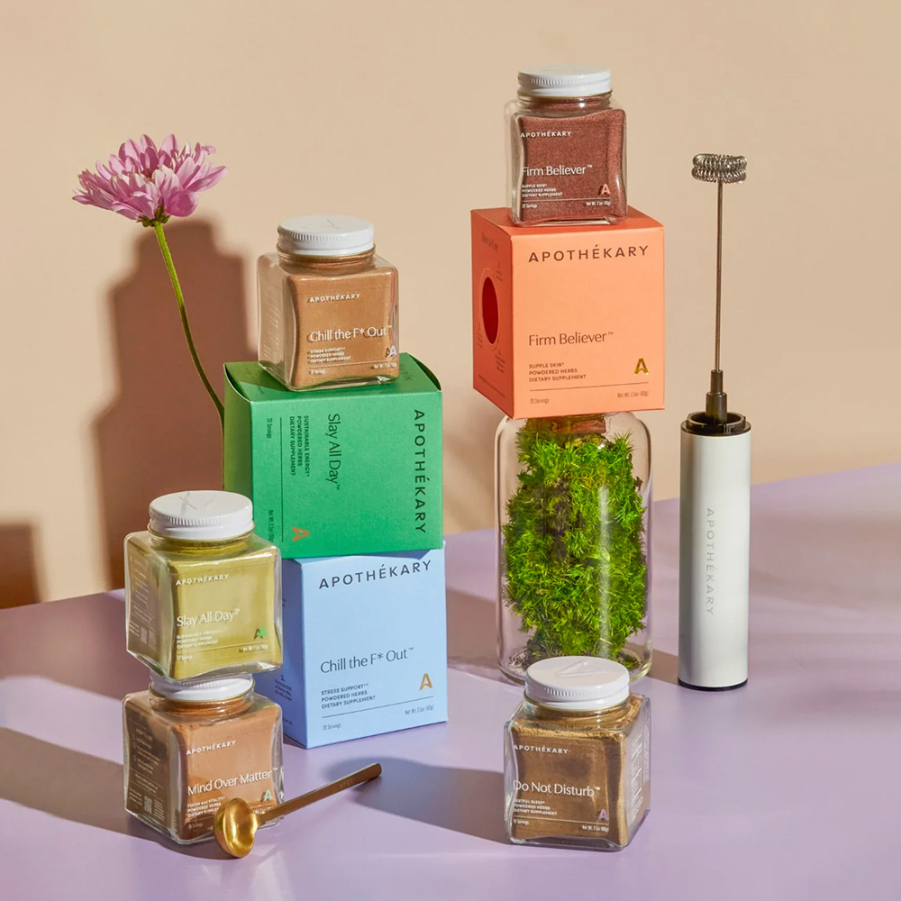
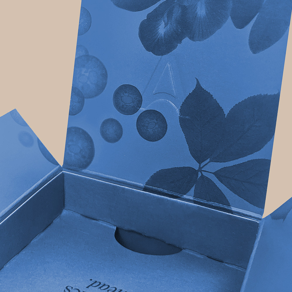
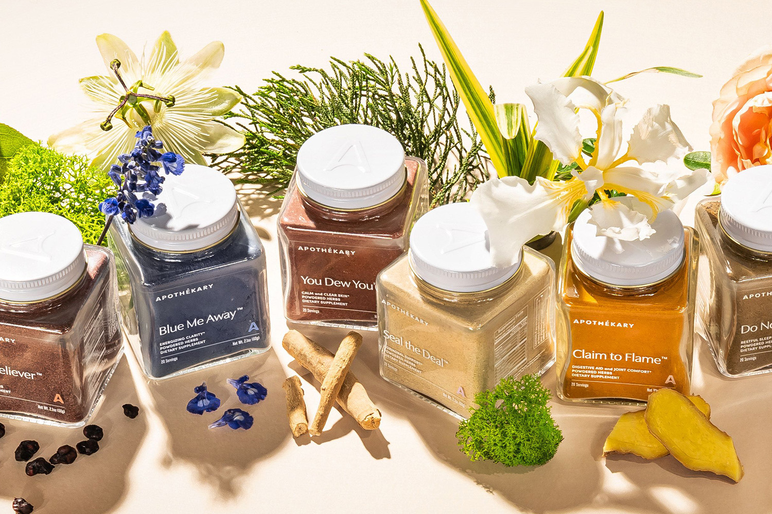
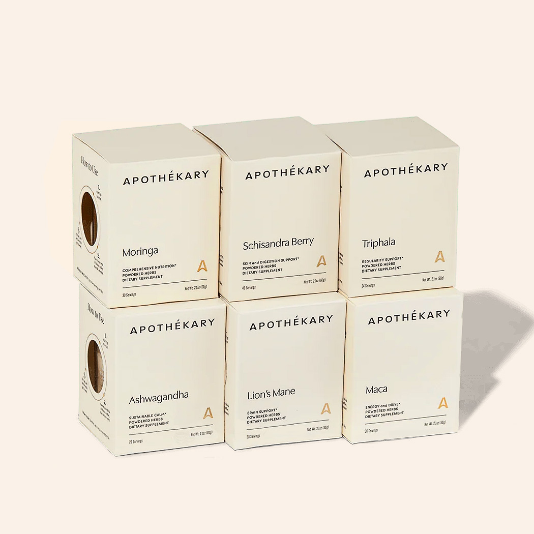
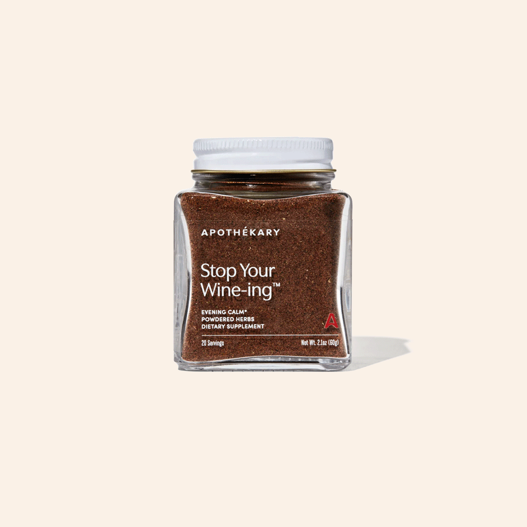
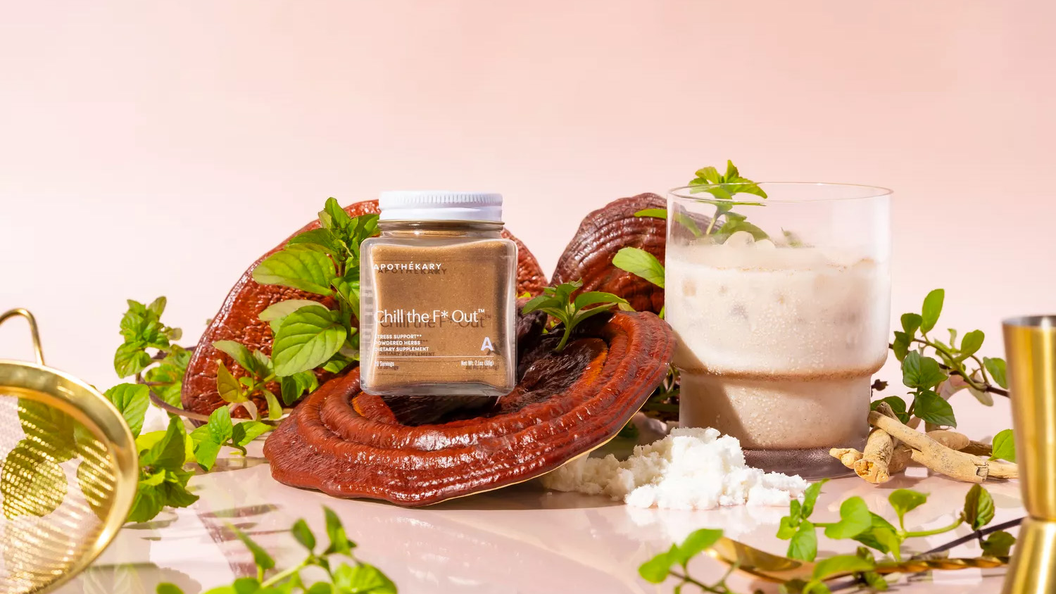
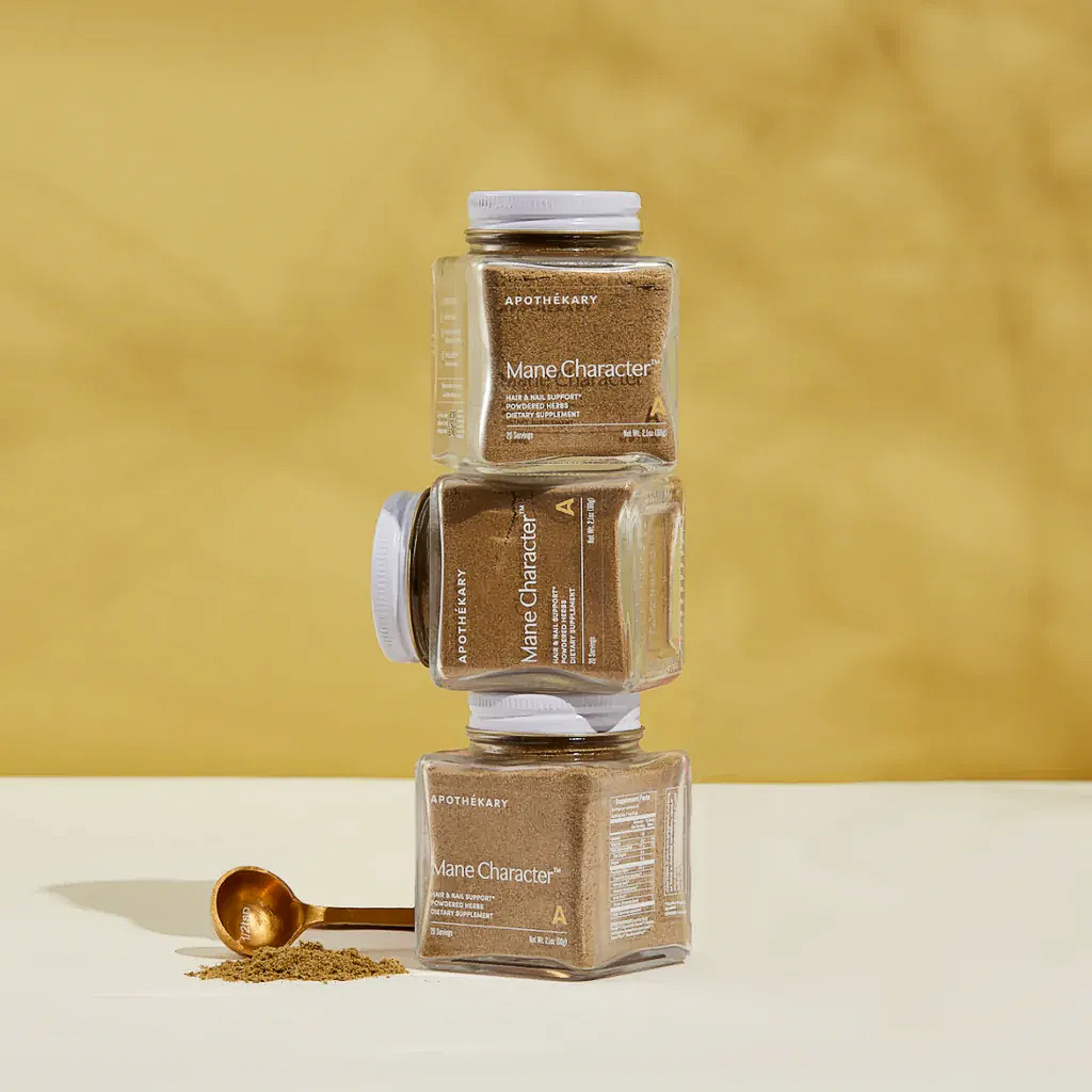
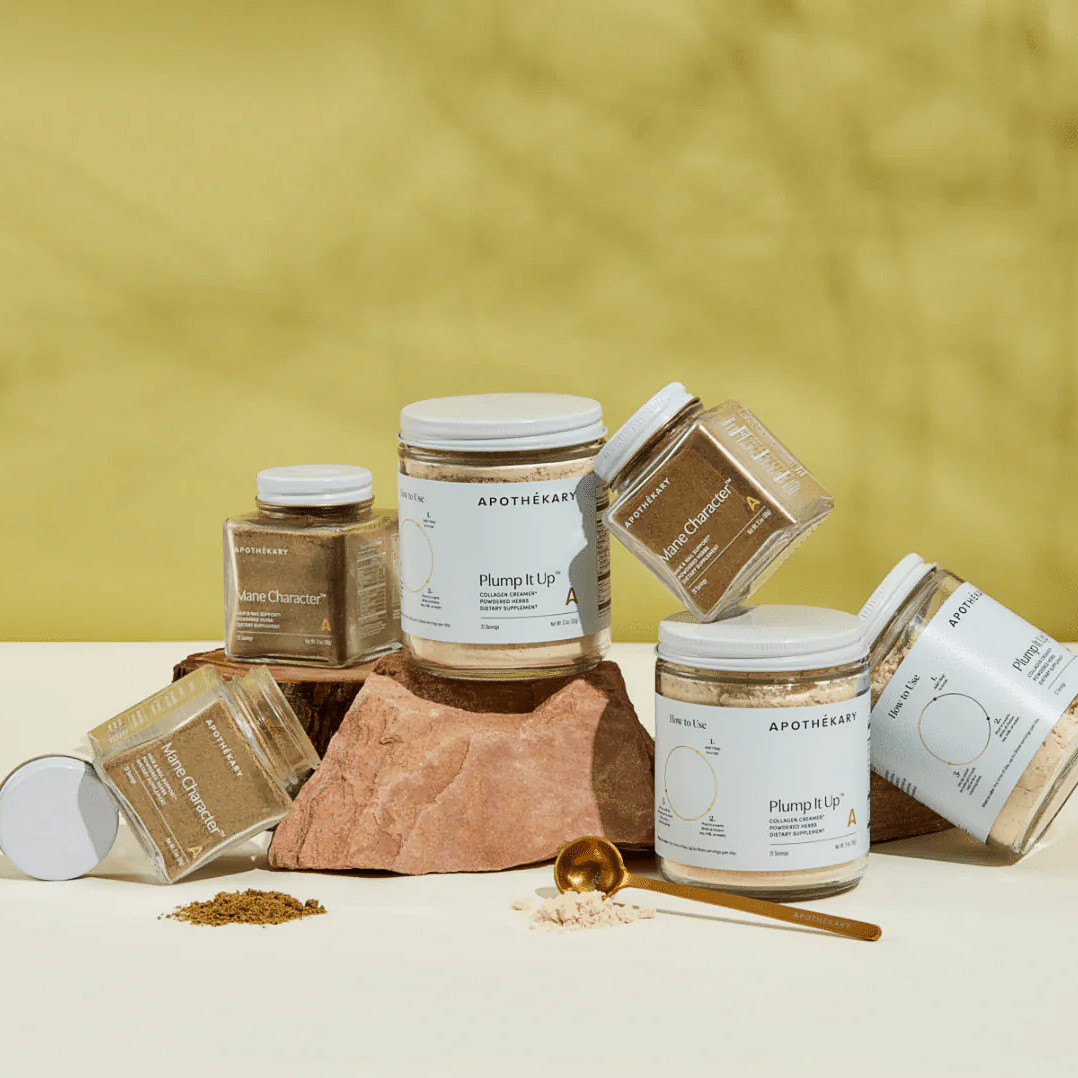
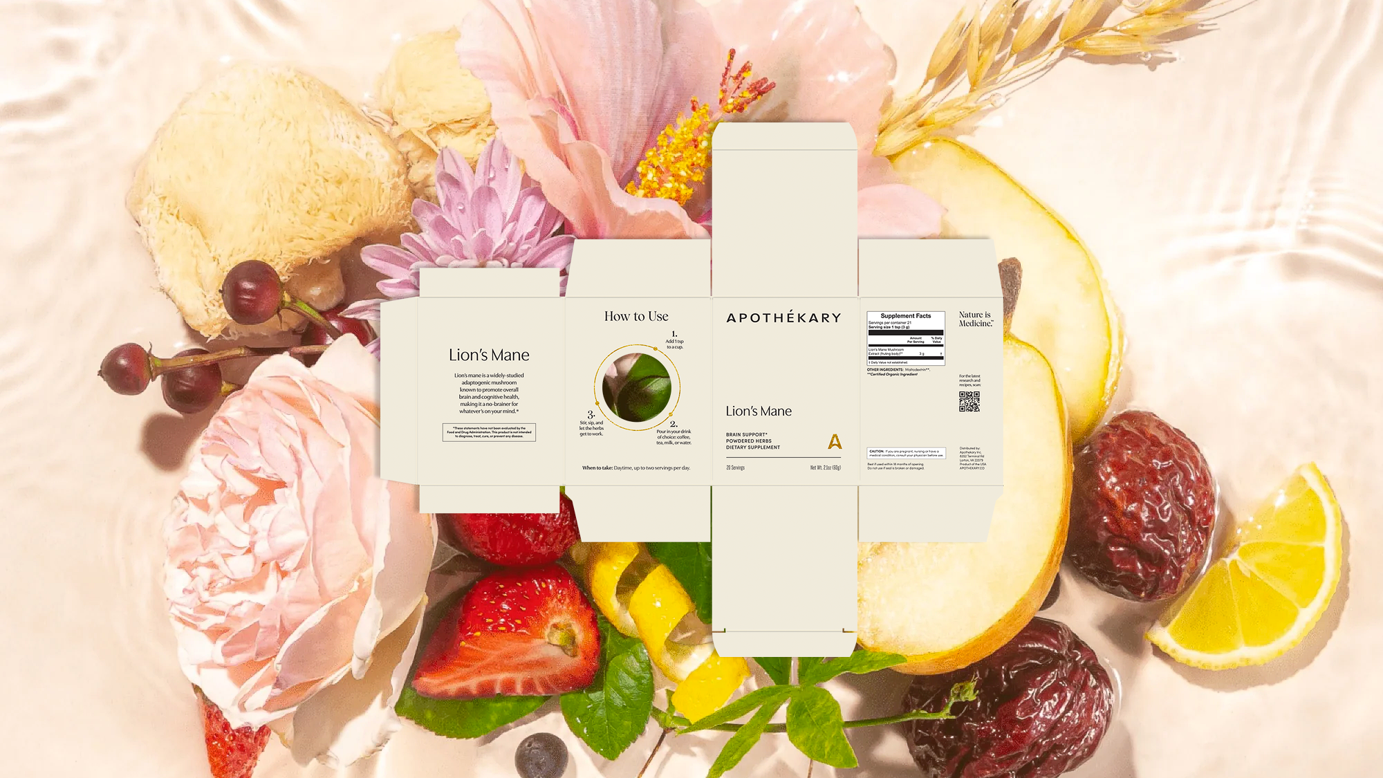
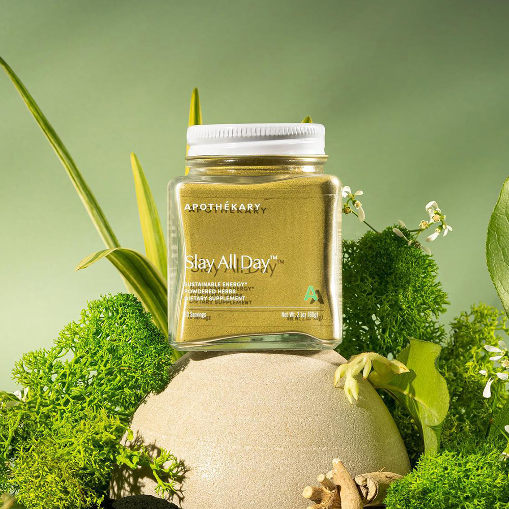
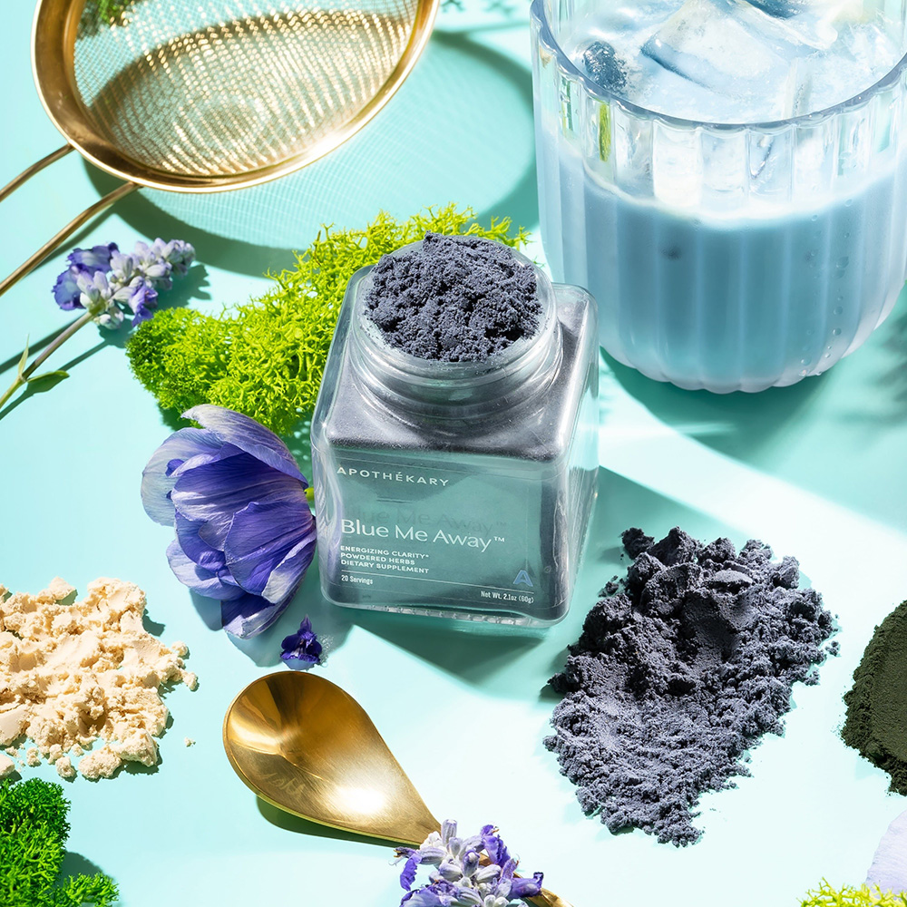
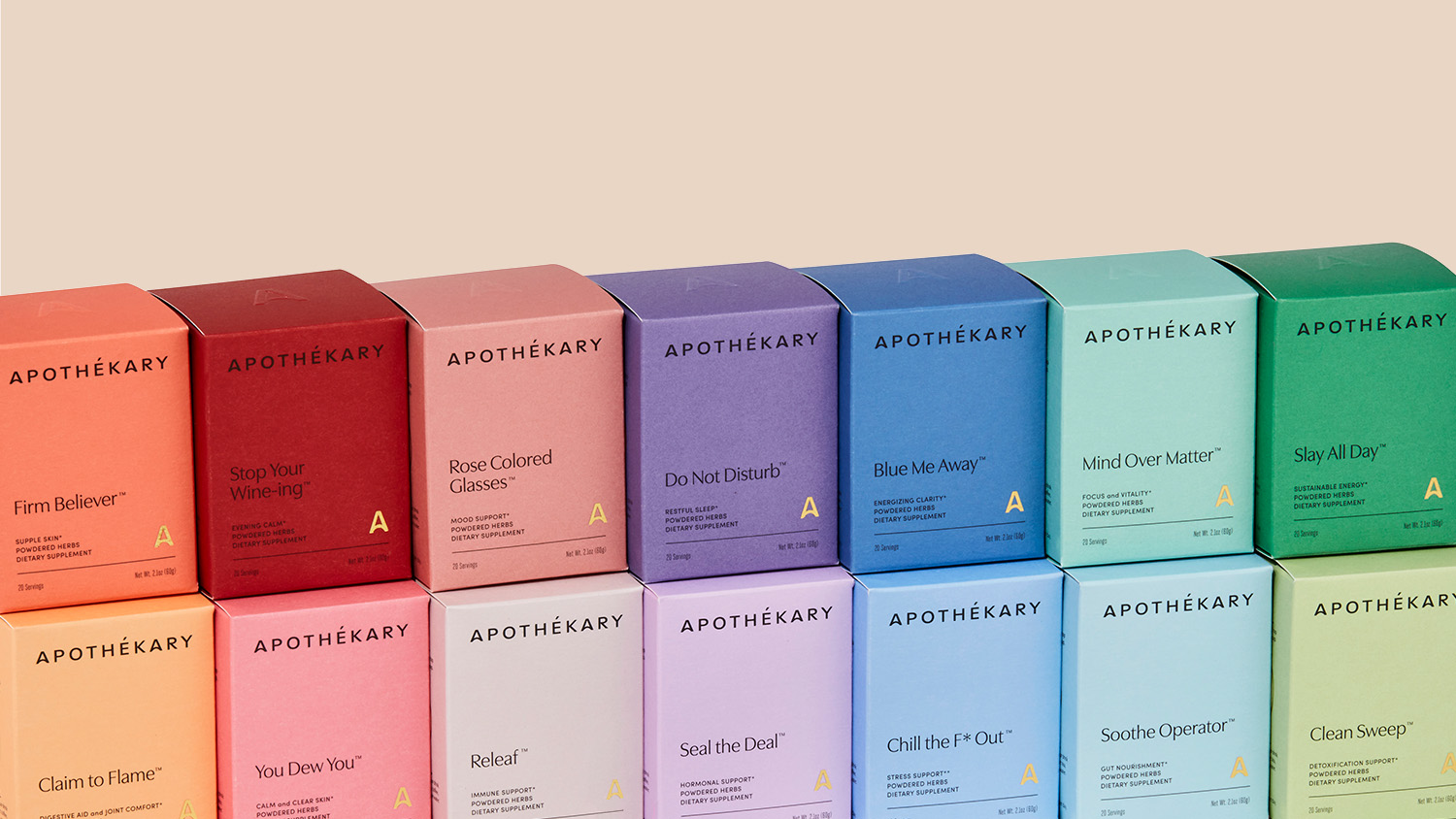
For their packaging, Apothekary recruited me to execute Forner’s vision. Each signature formula stands out with a distinctive color palette, ranging from serene blues and greens to vivid reds and pinks. Through ingredient collages by me and Forner, the signature and single herb boxes depict the real plants behind the formulas. The box’s addition of gold foil logos introduce an element of sophistication and the strategically placed die-cut invites viewers to glimpse the jar inside. The jars themselves are uniquely cubed with embossed logo-marked lids that add subtle distinction to the packaging. Apothekary’s new look and feel reaffirms its goal to make plant medicine an accessible and enjoyable part of everyday well-being.
Services
Packaging